The Sapphire Verdict
Once again, we are gathered here together to witness the birth of a new blogpost… that I’m pretty sure has the same exact title as a previous one… go me! It’s been a rather long week for me, but productive all the same! I’ve got updates for numerous things, and a bit of a breakdown regarding the newest piece that I’ve already sent to bluesky! Since that piece is already out there, let’s just hop right into this and go over, in depth, the cover concept art for the Sapphire Verdict!
Concept Art
At long last, here it is, the concept of the Sapphire Verdict that I came up with YEARS ago. I can’t even remember how long it has been now, but this is what I’ve had in my head as a cover piece for a long, long time, so… take a gander!
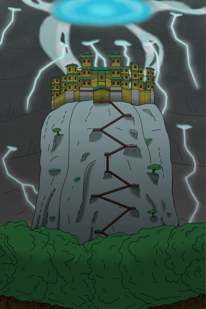
I said it before, and I’ll say it again. This is a concept piece! I am NOT going to slap this on the front cover of my book. It NEEDS a skilled artist to bring to life fully, but it gets the concept across quite well, and I daresay that I did a decent job with it! So, without spoiling too much, this cover does a couple of things. Number one, it showcases Sapphiria and Atom, the two main characters of the story. Sapphiria is an outcast with a penchant for engineering, and Atom is her best, and only, friend. Almost every chapter of this first book is dedicated to following their journey, and the cover kind of shows where they’re at in life. She has a robe that doesn’t match her color, Atom is a little rusty looking, and she’s still as timid as she’ll ever be. So, in essence, that simple pose of theirs show cases, fully, exactly who they are, but… what’s going on in the background? Without giving too much away, the background is actually the book’s climax, the moment when a superstorm of unprecedented scale launches a full scale assault against a Sanctum perched atop a rocky pillar. Why is this superstorm attacking? What is this Sanctum? What does it have to do with Sapphiria? Well, you’ll have to read to find out!
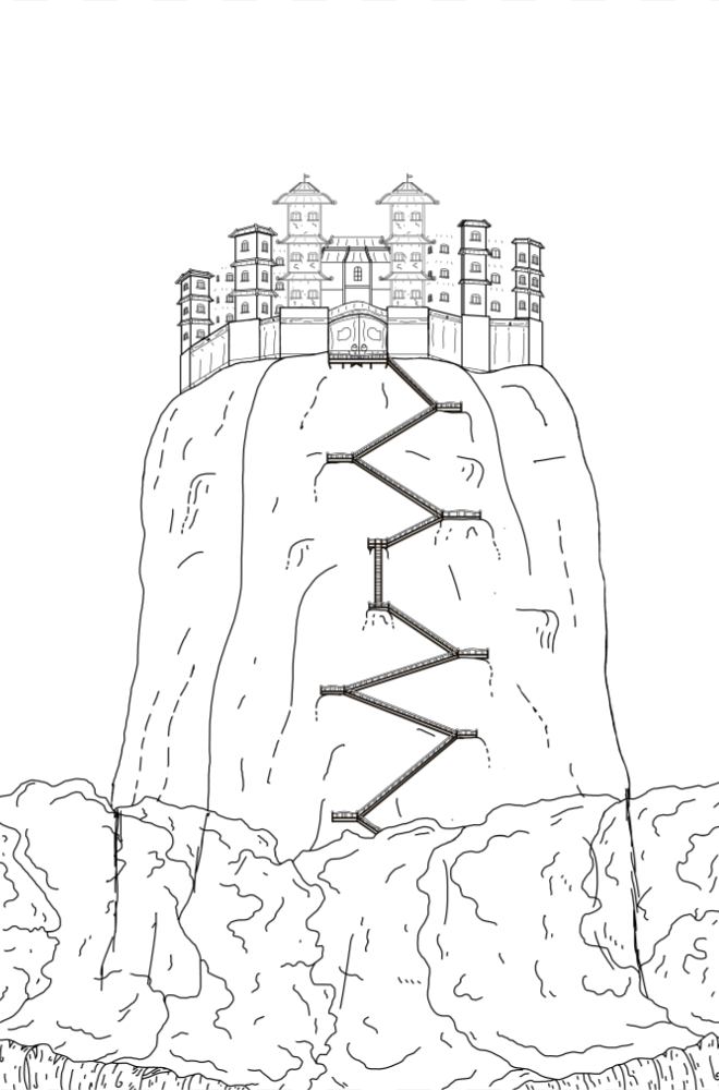
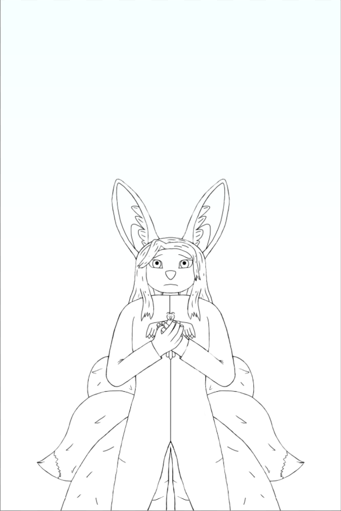
So, I didn’t just want to show off the book cover and call it good. I also kind of wanted to delve into the process I used to bring this to life. For starters, I tried my best to emulate the style of an artist by the name of Blue Turtle, someone I’ve been fond of now for years. I love his style, and it felt like something I could learn, so I gave it my best shot! Starting off, I, obviously, did line work, but it was almost entirely linework for the background! That included the forest, the pillar, and the Sanctum itself. Sapphiria came later.
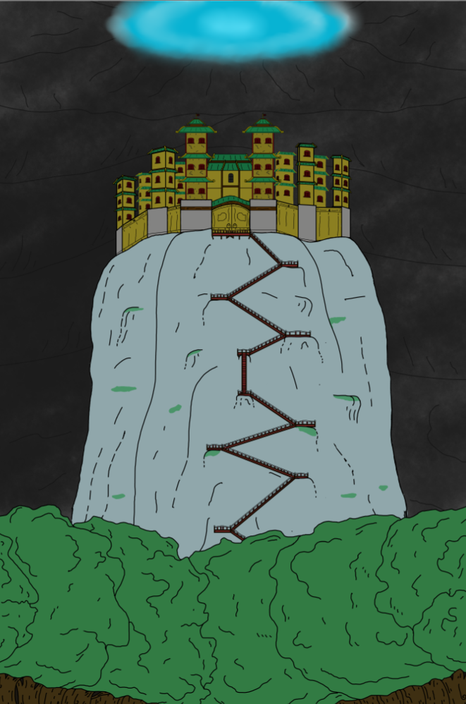
From the picture, you can see all the linework that went into this. A lot of it would end up being hidden, but I wanted to prepare everything I could in case I wanted to make changes. I started off with a more sketch style and then came back through and sharpened up all my lines after I was more confident. Some of my lines were thicker than others based on how much detail I wanted to get, and how much I wanted things to pop, which is visible more in the Sanctum itself than anything else. Afterwards, I did a basic coloring layer.
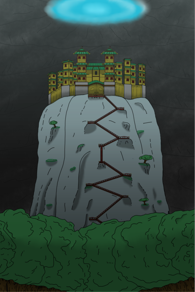
You can see how flat everything looks in this layer. It doesn’t pop at all, which was as intended! A huge chunk of what I learned from this project was the sheer impact shadows and lighting have on a piece. Had this been a LONG time ago, I would have stopped here, but I’ve learned quite a bit over the past few months! Clearly, the next piece to do was… shadows and lighting!
You can see from all of this that the shadows and lighting made a HUGE difference. It made everything pop and have depth to it, and a couple of other things were added in the process. At this point, the basics for the background were done, but the sky… needed work.
All the focus of the sky was on the giant eye of the storm. This eye… isn’t getting spoiled, but it’s powerful and not at all natural! I wanted to convey that properly, so I added the ribbons of energy flowing out from it like tendrils. The lightning was a bit difficult for me to do, and I’m not so sure I nailed it, but I got close enough. I included lighting on the clouds to try and add more depths to the strikes themselves, and I’m overall pleased with the outcome. With all those details out of the way… it was time to add the main focus, which happened to be the piece I got bogged down on for what will be obvious reasons…
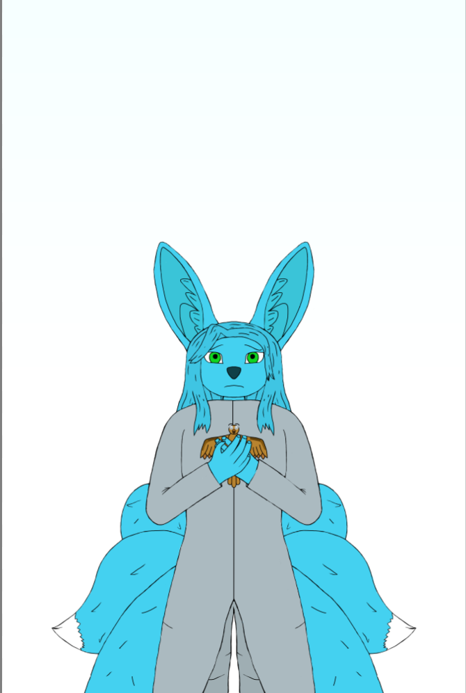
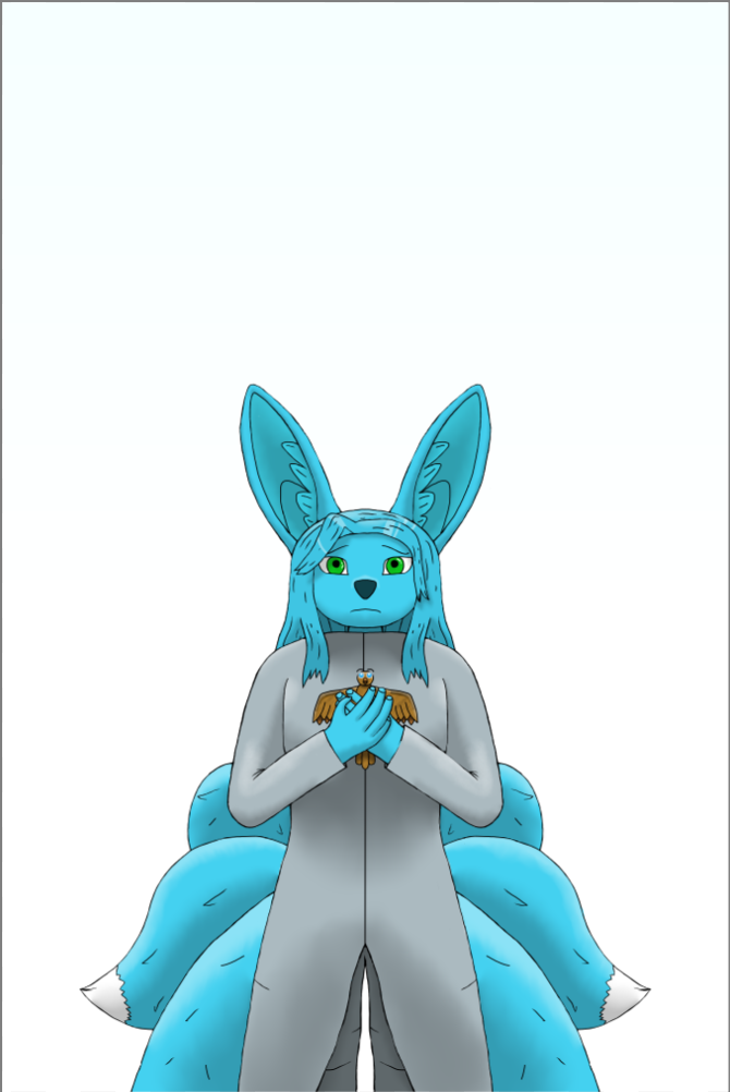
Sapphiria herself! Drawing people has always been a major hurdle for me, so drawing a bipedal fox hybrid alien was a HUGE challenge! It took me FOREVER to nail the line art for her, and I went back over it many times. In the end, there’s still parts I’m not happy about, but it was good enough for me to at least work with. What I really wanted for this piece was to emphasize her posture and expression. She’s supposed to look kinda meek and sad because that’s where she’s at in this first story. She hasn’t become the dominate and relentless empress she’s destined to become just yet, so there’s no point in her looking tough. Oh, and Atom is there too, being clutched tightly against her chest almost certainly because, as always, she’s trying to protect him.
Next up was the coloring for the both of them. This was fairly straightforward in all regards, and it led in to the part that was a little more complicated.
Shading! As I have learned over the past few months, shading is critical for making a piece not look terrible. I spent a bit of time going through and doing both lighting and darkening passes to place emphasis on different parts of her. I made sure to shade her tails, the inside of her ears, account for shadows, and also tried to fiddle with the eyes a bit. From there, there was only one final piece!
And there you have it! The Sapphire Verdict was the last piece to be added. I started with a vector and then outlined it manually before repositioning everything. I also did lighting and shading to make it look more metallic and crystalline, and, overall, I’m extremely happy with the effort. That being said, I did just recently discover a trick for crystal that a part of me is curious about implementing here… another day.
That was the full process of how I created the piece from start to finish. Part of me wants it here just so I can admire my own progress, and the other part just wants to make it clear that I don’t use AI. Hopefully that’s clear from my efforts, but, really, I just want everyone to enjoy seeing Sapphiria brought to life a little bit more! I know I was thrilled to finish this up at least! With this piece done, I’ve finally been freed up to work on something new, and… I can actually show a bit of it off already!
What’s next?!
I said a week ago that my next project would be James Stockton, but I’m making a quick detour! Instead, I want to revamp part of the website, and that means, once again, more assets. In this case, I need faction logos, so the Faction Logo project has become my new focus! This means giving a logo to the Sapphire Eye, the UEC, and REDACTED, all three of which I’ve had planned for a LONG time. I do not know how long it will take, but… the Sapphire Eye logo is almost good to go! Take a gander!
Conclusion
That’s all there is to discuss for this week! I hope that it was an interesting read, and I hope that the faction logos prove interesting whenever I manage to get them all posted here! Next week, I want to focus the discussion on the logos and some information about the factions themselves! At the very least, get ready for a blog on the mighty factions of the Sapphire Verdict universe! With all that being said… CHEERS!
The Flying Fennec


